
London creativity in the GCC: the KOA brand design project
Posted 3 days ago in brand identity, luxury hotel design, photography, web design
Read more
Posted 9 years ago in design chat, print
At a party, a fairly typical question is, ‘what do you do for a living..?’ to which I always answer that ‘I’m a graphic designer’. Now, a London graphic design type is two-a-penny around here. It causes some confusion…
Which is obviously the bald fact, though running a small business is rather more involved than that, but starting down that line of conversation can be just a little off-putting when you’ve just met someone who doesn’t necessarily want to hear that level of minutiae.
Anyway, an incredibly commonplace but slightly bizarre next question which always throws me is, ‘so… what do you actually design?’ – graphic design itself being a sort of vague cover-all for many potential sins, apparently.
Of course, stepping back from my day to day work, it’s not actually an unfair point. But when this question was asked a couple of weeks ago, it got me thinking about what we as a company actually do for clients and what it means to be creating a great piece of graphic design from London, today. What makes design from the capital special? I’m firmly of the belief that different countries have very recognisable design styles, which is of course a wonderful thing. You commission a designer from Madrid or Cape Town because you like the way they have thought about the brief and the spirit they bring to it. But it’s rather strange to turn the mirror on yourself and figure out what the uniquely ‘London offering’ that as a city we bring. What is ‘the London graphic design style’?
I could be at this topic for days, but to try and assess this I’ve chosen two examples which, to me, are very telling.
A few days ago, I wrote a blog post for the Shine School Media Awards, which is a project we’ve been involved with for the past year. The challenge I had been set was to offer some design advice to the secondary school pupils who were entering the awards this Spring. I remember really clearly designing so many different things at school. For instance, posters, theatre programmes, signage for noticeboards immediately spring to mind. So I was trying to think what a good place to start in terms of useful help and inspiration to create something really ‘stand out’, but also clean, clear and hopefully beautiful. As I was thinking about the way I work, I kept coming back to the same source, which is my first ‘London graphic design standard-bearer’ (no pun intended): the newspaper.
I’ve chosen three tiny samples of recent newspaper design which stood out for me –
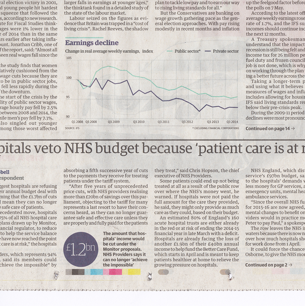

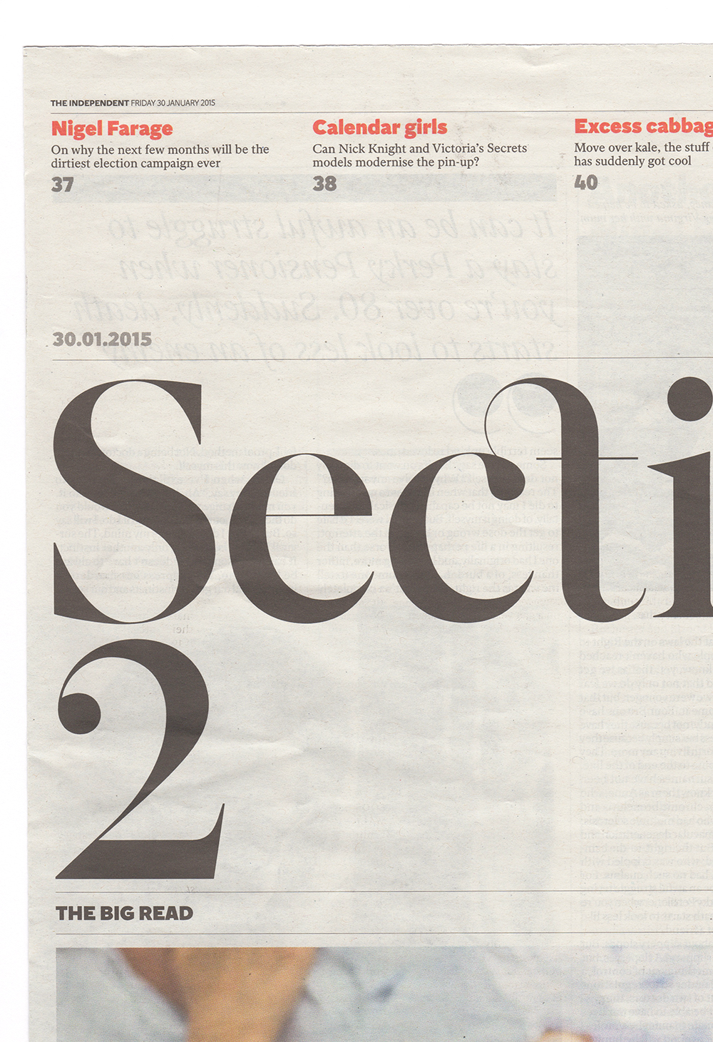
(from top) Moments of beauty within The Guardian, The FT and The Independent
So my first thing of beauty and design inspiration is tomorrow’s fish and chip wrappers.
For me, when design is good in the UK, it’s seen first in a newspaper. The immediacy, the ongoing change, the fact that everything is constantly questioned. The way that the design of the paper feeds into the web, then when the paper’s site gets improved or re-thought, that design feeds back to the print edition. It’s fascinating. Needless to say the newspaper also has many other ways design can express itself, particularly where news itself becomes features and promotional material for film, tv, books, and so on – listings and weekend supplements.
Here things start to diversify in terms of their function because we cross from newsprint (by which I mean the physical grey paper itself) to something slightly shinier and smarter. And all of a sudden, there’s this huge parity between a supplement and something that could have the same graphic language as a promotional brochure, or even a political report. And thus the sort of work we do every day.
And the second standard-bearer? Why, a humble box (or two) of tea.
Obviously the British drink a lot of the stuff, so a box it arrives in is always an unwitting object of scrutiny as you wait for the kettle to boil. But the reason I mention it is that I am thinking of supermarket packaging in general – and usually ‘own brand’. In order for their own (usually deliberately less expensive) product to stack up against the supposedly more desirable well known brands, the key is uniformity and more often than not, as a result beauty. Though perhaps that says more about me and the design styles I enjoy than what supermarket packaging designers consider best practice!
I thought I would choose a fairly common-denominator single example as a motif for my argument, and here it is – Waitrose ‘own-brand’ tea series. Not the economy basic range, nor something super-deluxe, but a product that’s been very carefully considered on the outside.
I’m sold, and I’ve not even got the water on…
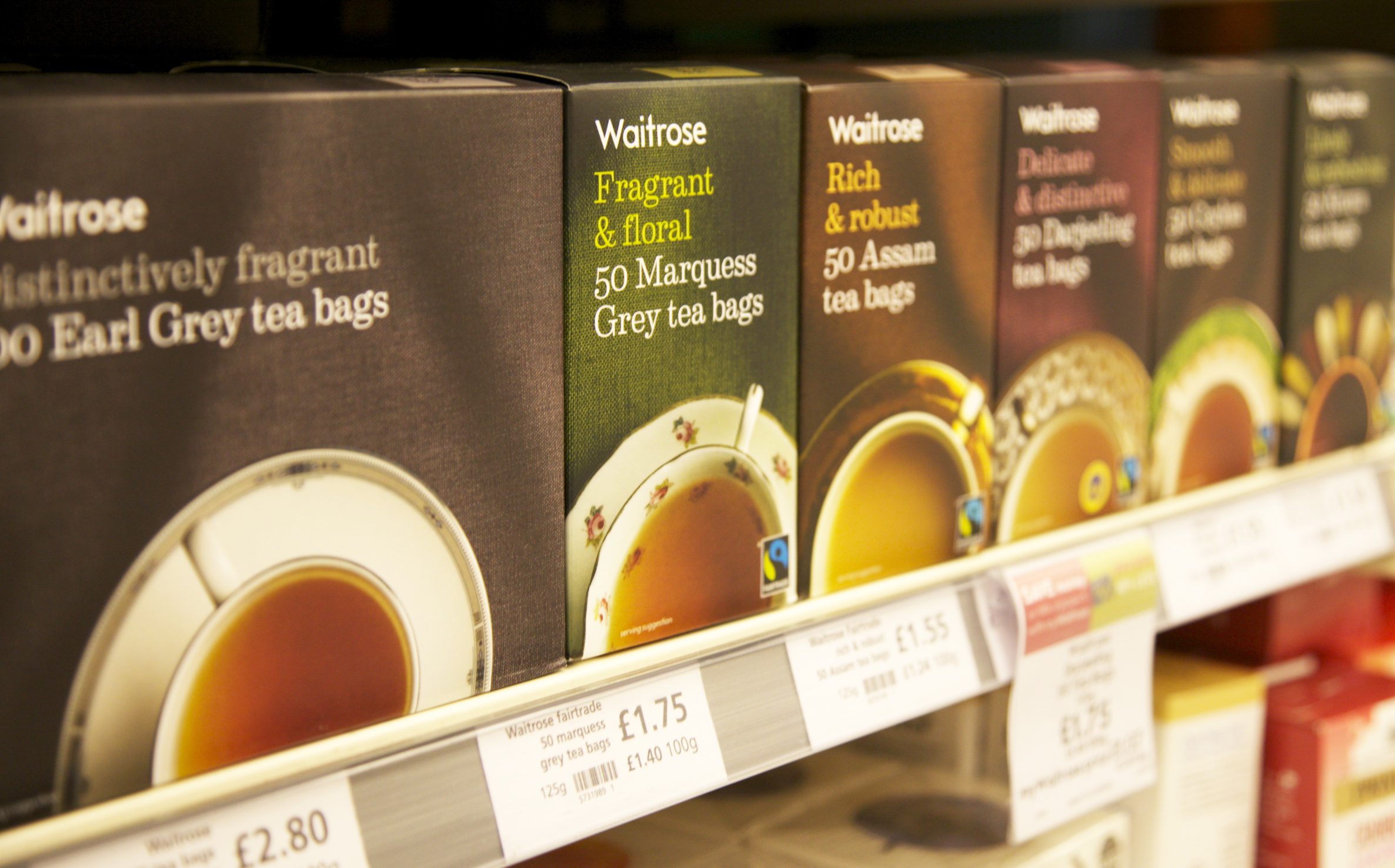
Wow, I just love the way these boxes of tea have been designed.
There’s seemingly not a lot going on here, but I believe that’s the skill. So much thought has gone into the range of teacups, the fabric the cups sit on, the fact that they’re each viewed from above, and the elegant, simple use of type and tones. This carefully considered piece of packaging says everything to me about today’s London graphic design style.
It’s also very telling that the design of this own-brand range, different from the budget ‘Essential’ designs (which are lovely in their own way) travels beautifully across the product line. I also really love the design of the flour bags –
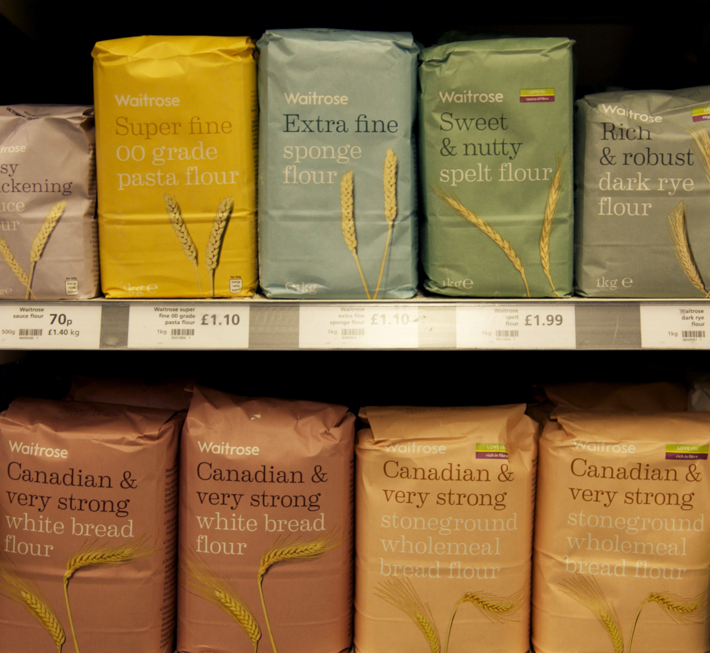
The typography is the same, yet another genre of product altogether, yet feels familiar. As a customer, you know it’s own-brand, but somehow not ‘the cheap stuff’. The serif typeface and left hand justification, the use of an incredibly elegant colour palette. It tells a story of a simple product. I just want to get out my rolling pin and apron.
So what is my conclusion about the London graphic design style?
It’s best enjoyed on the sofa – tea, cake and a sit-down with the newspaper…
Posted 3 days ago in brand identity, luxury hotel design, photography, web design
Read more
Posted 2 weeks ago in animation, brand identity, design chat, print, web design
Read more
Posted 4 weeks ago in brand identity, design chat, web design
Read more