
London creativity in the GCC: the KOA brand design project
Posted 2 days ago in brand identity, luxury hotel design, photography, web design
Read more
Posted 8 years ago in design chat, web design
One of my great failings as a human being is just not being able to live a spare, minimal life. I wish I could be otherwise, I would dearly love to have less stuff, and feel less attached to it. Yet, the random attachment I feel to the objects around me is far more because of the habit, versus genuine need, of them being there. When they’re gone, I prefer the space and cleaner lines. So as a result the objects I have around these days tend to be cherished and a result of distillations of multiple charity shop visits. Meanwhile, my goal with client commissions is to apply the same sort of firm distillation to our design work, meaning that when people scroll through a website it’s a genuinely simple user experience.
When working on simplifying a creative layout, it does help to start with a brief that encourages this. A good example is our work for Montrose Capital, a discreet property investment business based in Mayfair. Interestingly, while their day to day business is often hugely involved and complex, by virtue of necessity in terms of client confidentiality, their website and marketing is exactly the opposite.
Here are a couple of examples of the simple user experience we’ve created for this client;

Montrose Capital – a good example of a simple user experience web design
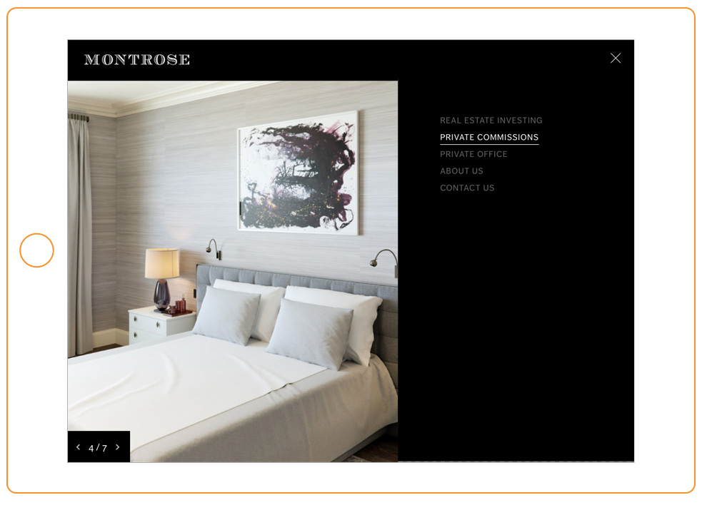
Montrose Capital – a good example of a simple user experience web design
A crisp description of their work and beautiful photographs, some of which focus on sites they have worked on, means that a simple user experience is not merely something to strive towards but results in a minimal design almost by default. This is particularly true of the menu system which ties visually with the top banner and image toggle tool bottom left of the page, giving focus to the navigation but letting it almost disappear.
Visit the Montrose Capital website
A totally spare or minimal approach is an attractive one, but of course isn’t right for every client. This is particularly true of a site marketing a business that thrives on a homely, cosy approach. Harking back to my earlier rather mixed relationship with clutter, I will be the first to say there’s most definitely a place for home comforts, a belief shared by this next client. We spent time working with ongoing client Indigo Design Associates firstly on defining a new brand identity then secondly a portfolio website. Indigo’s brief was to let the images do the talking, albeit within a frame which ‘owned’ the images. So you have this interesting balance between seeing their clients’ homes and knowing the designer behind the overall look of the place.
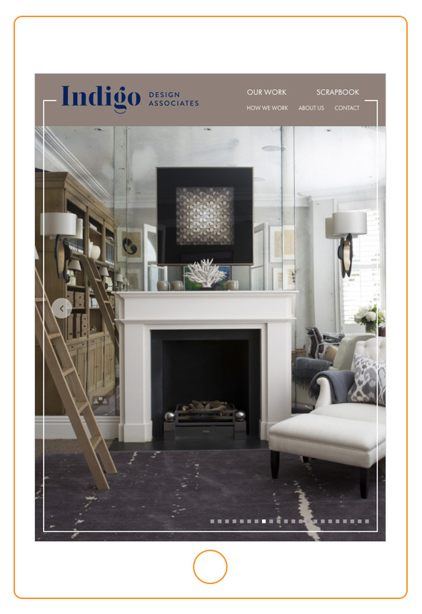
Indigo Design Associates – a good example of a simple user experience web design
Indigo Design Associates – a good example of a simple user experience web design
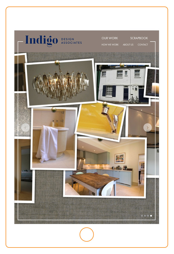
Perhaps the antithesis of true minimalism, in particular I like the ‘scrapbook’ section of the site. Many people use Pinterest to gather the content for inspiration these days, but nothing beats a series of great, connected images on a board to explain to a client how their home (or photo shoot/brand image/etc.) is going to look. For the first time a client wanted this tumble of interesting photos together, creating that rarest of things, a simple web page to pore over and consider.
Visit the Indigo Design Associates website
Whenever we get a corporate web design brief, inevitably it tends to be text-heavy and image light which is a designer’s worst nightmare, but just occasionally what comes in is an opportunity to have a little fun. In the case of real estate investment firm Mansford LLP, it meant a short walk from our studio on a sunny day down to Chelsea Harbour to take a new version of a photo they had sent me in low resolution. That (the dome of the Chelsea Harbour Design Centre below) ended up being the only colour photo on the site, and worked very well with the simple user experience at the core of our design for the site.

Mansford LLP – a good example of a simple user experience web design

Mansford LLP – a good example of a simple user experience web design
A key part of any corporate web design is legal or services information text. It has to reassure, it has to explain but is rarely read. To combat this, we try and ensure it’s as pared back as necessary as well as being relevant to the user. The next stage is to make the layout of this copy as clear and straightforward as possible, by dividing it into three sections – header, opening copy and the balance below. Personally I find this makes rather dense information feel just a little fresher and more ingestible. A small step admittedly, but in the context of a necessarily formal site, these things make a big difference.
If this sort of design and approach to content be right for your business, we would be really interested in helping you out.
The photograph at the head of this post is from the Indigo Design Associates website
Posted 2 days ago in brand identity, luxury hotel design, photography, web design
Read more
Posted 1 week ago in animation, brand identity, design chat, print, web design
Read more
Posted 3 weeks ago in brand identity, design chat, web design
Read more