
London creativity in the GCC: the KOA brand design project
Posted 7 days ago in brand identity, luxury hotel design, photography, web design
Read morePosted 10 years ago in brand identity, design chat, print, web design
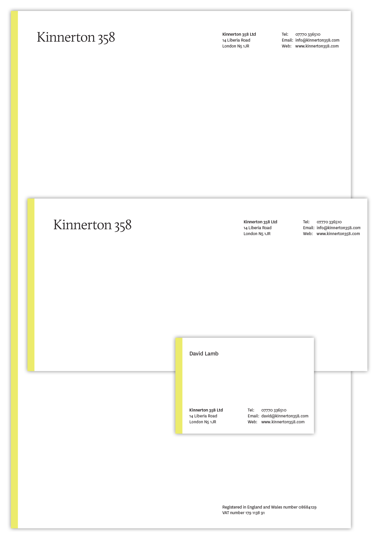
Kinnerton 358 was the telephone number that branding guru David Lamb had growing up in Wales. So when earlier this year he decided to become a consultant he decided to use that as the name of his business. David approached us to make this instantly memorable name into an identity, yet not a brand or a logo. So we put together a rather lovely piece of typography but… it needed something else to stand out. Rattling out a few words for a consultancy brand design project wasn’t enough.
And that’s where the yellow came in.
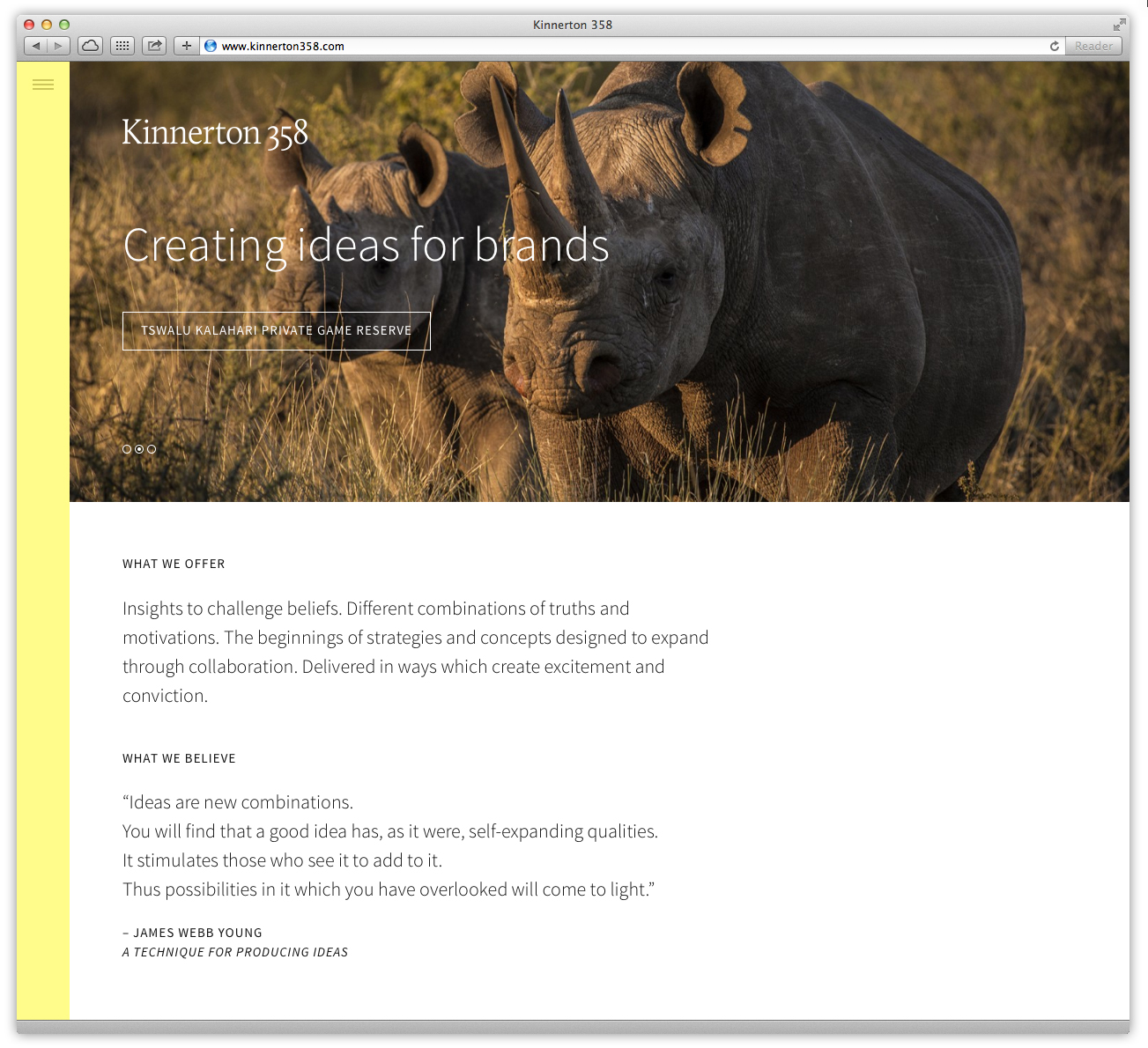
The Kinnerton 358 website – a key part of this consultancy brand design project
A simple stripe. It started on the letterhead and was greeted with delight by David, and then that began to appear everywhere, most usefully on the website where it became part of the navigation. Sometimes it’s those simple things…
The Kinnerton 358 website – a key part of this consultancy brand design project
The website itself looks great – it’s got some fantastic photos on there (especially from Tswalu Game Reserve in South Africa), is full of information and copy heavy yet never seems overwhelming.
Overall I think this project works really well and in particular is a great example of how information-dense websites can be clear and readable.
Posted 7 days ago in brand identity, luxury hotel design, photography, web design
Read more
Posted 2 weeks ago in animation, brand identity, design chat, print, web design
Read more
Posted 4 weeks ago in brand identity, design chat, web design
Read more