
London creativity in the GCC: the KOA brand design project
Posted 2 days ago in brand identity, luxury hotel design, photography, web design
Read more
Posted 9 years ago in brand identity, design chat
To a graphic designer, the idea of designing a shop-front for an entirely new brand is not merely exciting, it is thrilling. So when we were approached by our long-time client Le Verre Gourmand, hitherto solely based in the skiing chalet heartland of eastern France, to create a new UK high street wine retail design concept, we leapt at the chance.
‘Thirsty’ is a new type of wine shop at a time when buying booze on the high street has never been more squeezed by the big chains. To compete, Thirsty does what retail does best – it takes a wine retail design concept and innovates.
In-store, the selection is smaller, crisper, more eclectic. Only wines that have been incredibly carefully chosen are featured, and they’re offered in magnum and regular bottles. Throw in an enviable selection of craft beers and you’ve already got a great offering. But Thirsty want to go further: they’re not only selling wine but also beer from the vat… and giving you the chance to sit down and enjoy it in-store.
![]()
The logo for Thirsty, a key part of our wine retail design project for the company
Our new logo for Thirsty was devised over several months and the notion of it was originally based on Delacroix’s iconic painting ‘Liberty Leading the People’ – just without Liberty herself. I very much like the idea of a flag being a shopfront: it lends itself neatly to the shape available and is a bold, unusual icon for the high street. It was just a case of getting the right flag.
We’ve spent some time this summer working on drawings of the perfect flag, a neat furl and ragged end… and there have been multiple iterations! The finished product was hand-drawn from scratch with custom typography. The design will also work at all sizes, and we’re hoping to see it appear on stamps, point of sale communication and posters soon.
We’re told by the team at Thirsty that the feedback from customers and locals on the street has been overwhelmingly positive, something which is incredibly exciting and satisfying.
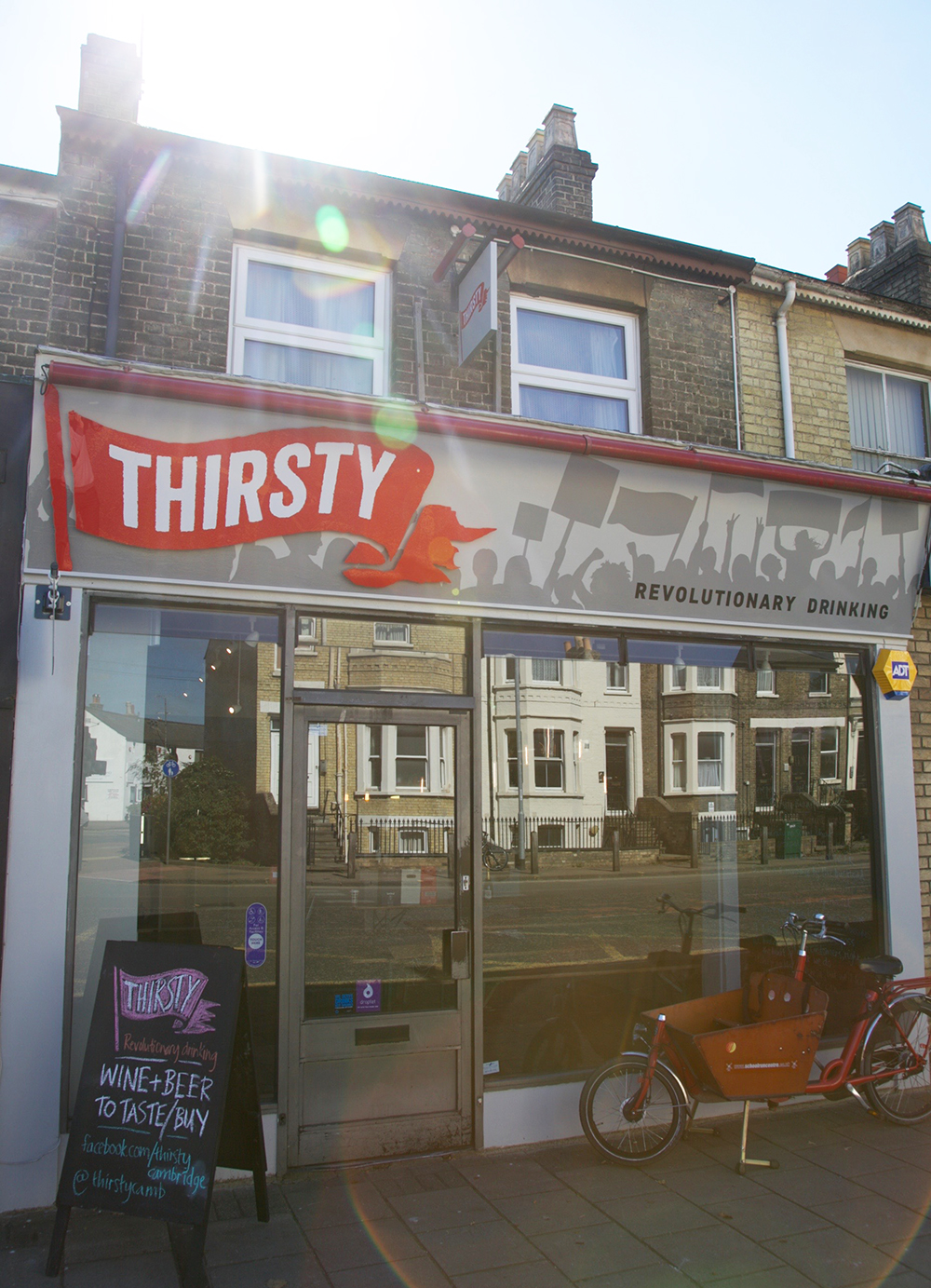
The Thirsty storefront in Cambridge, the first visible results of our wine retail design project for the company
At the store front itself is a brand we’ve been quietly working on over the summer. It’s inspired by the great British tradition of the protest. Silhouette images of banners and placards support the main Thirsty brand flag and are key to the graphic work we are continuing for Thirsty this Autumn. For us it’s a great new wine retail design project that continues in the tradition of our work for Oddbins, Thirsty parent company Le Verre Gourmand, wine brand Chemin des Pins and Castelnau Wine Agencies.
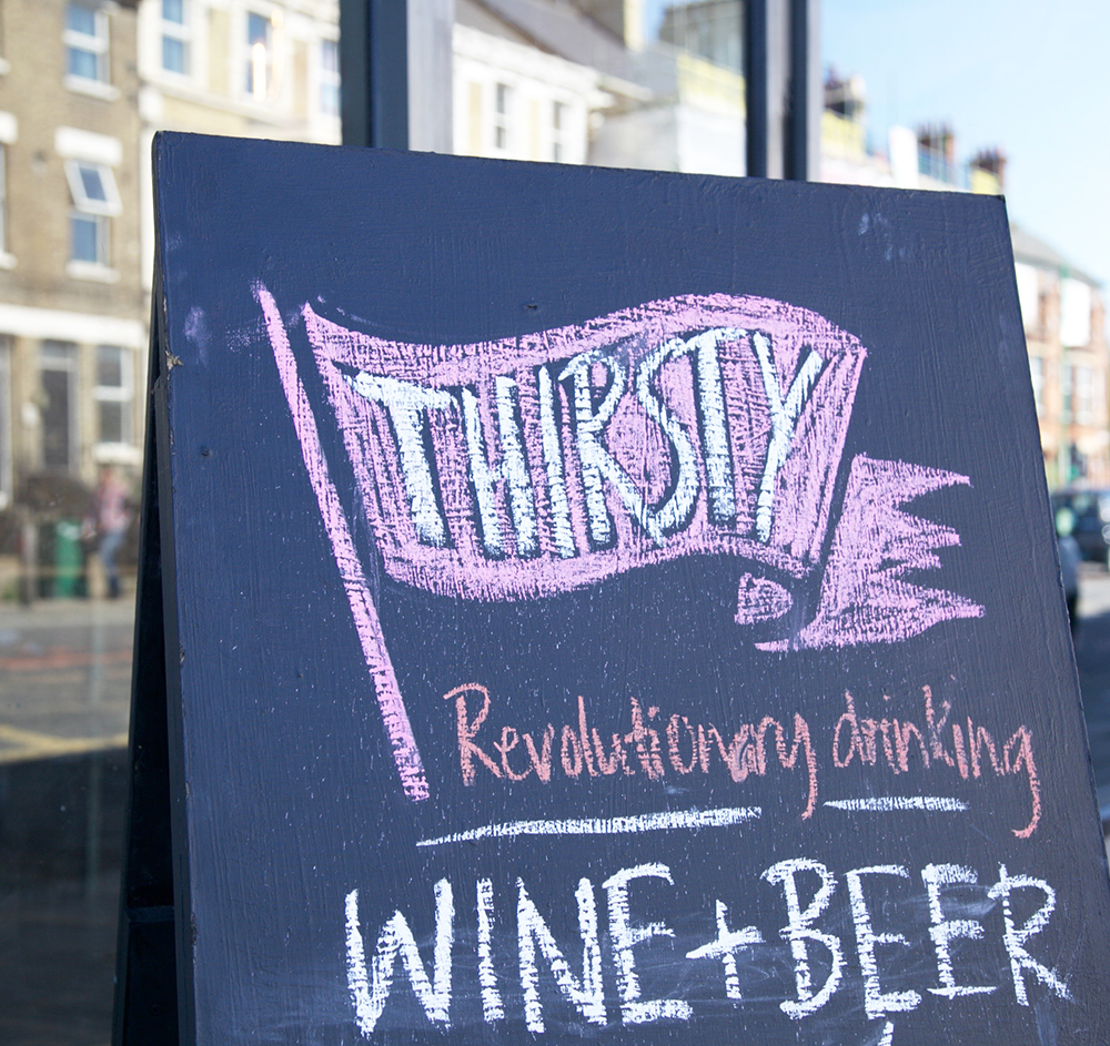
Finally, we always love it when a logo of ours is reproduced by hand. It adds a lovely human dimension for a brand – away from the graphic and into the real world. The team at Thirsty have promised us much more of this approach to the company, which is fantastic.
There are a number of exciting next steps to the project as the store interior is completed. We gather the amazing new coffee machine has arrived:
Ctibor is happier than ever with his new machine. Drop in for a coffee this afternoon. pic.twitter.com/CyuvplCNp1
— Thirsty Cambridge (@ThirstyCamb) September 16, 2015
And collaborations with local street food suppliers have been going well:
5pm is burger o’clock today with @steakandhonour. Then grab a wine/beer/soft and sit down inside. Kids welcome. pic.twitter.com/beSkhCQfTo
— Thirsty Cambridge (@ThirstyCamb) September 16, 2015
We can’t wait to wrap up the internal signage for the shop: it’s ripe for a season of (beautifully graphic designer) protest demanding much better booze (and a few more branches of Thirsty!).
Posted 2 days ago in brand identity, luxury hotel design, photography, web design
Read more
Posted 1 week ago in animation, brand identity, design chat, print, web design
Read more
Posted 3 weeks ago in brand identity, design chat, web design
Read more