
London creativity in the GCC: the KOA brand design project
Posted 1 week ago in brand identity, luxury hotel design, photography, web design
Read more
Posted 10 years ago in design chat, print
We’ve been working for the Parliamentary think tank Policy Connect for a number of years now, but now and again we embark on a stretch of work for them which is particularly fruitful – and we are in the middle of just such a purple patch at the moment, one that has focussed on information graphics design.
Having completed the Design Commission’s Restarting Britain 2 in March, we have embarked on a report for the Higher Education Commission in August and then just last week two further reports were completed – for the Skills Commission and the All-Party Parliamentary Health Group. It’s been a busy time.
The APPHG report that has just launched is entitled ‘A Guided Tour of the New NHS‘:
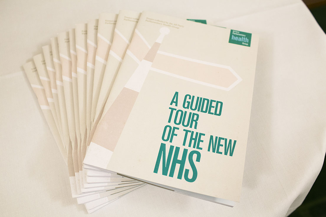
It’s this last piece of work that is of particular note here, not least because the Health Secretary Jeremy Hunt is holding the report in the photograph at the top of this post.
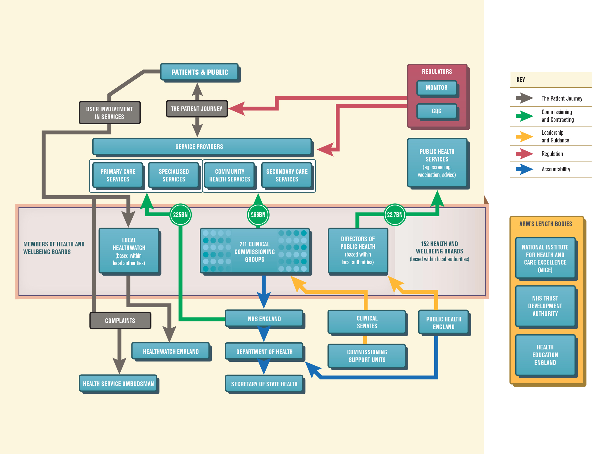
Central to the ‘Guided Tour‘ report was an information graphic explaining how the NHS operates.
No small matter, you would think, but this piece of thinking and subsequent design explains the National Health Service today in a way nobody has done before. As such, it was singled out as being particularly fine – which is something we’re really proud of.
Here’s Stephen Dorrell, Charman of the Health Select Committee, holding the report at its launch in Parliament last week. It’s always slightly surreal but incredible when politicians of this stature stand up and cite our work. It’s something that has a visceral thrill every time.

If you’re working in public policy report design, we would love to hear from you – please get in touch.
Posted 1 week ago in brand identity, luxury hotel design, photography, web design
Read more
Posted 2 weeks ago in animation, brand identity, design chat, print, web design
Read more
Posted 1 month ago in brand identity, design chat, web design
Read more