
London creativity in the GCC: the KOA brand design project
Posted 1 week ago in brand identity, luxury hotel design, photography, web design
Read more
Posted 4 years ago in design chat, web design
Our Creative Director Richard recently sat down with Amy McIntosh, Managing Editor of Furniture, Lighting & Decor. Based in Illinois, the magazine and busy sourcing website for purchase influencers reaches tens of thousands of subscribers. They discussed best practice around user experience for interior design websites and how designers and specifiers can make the most of the web.
While every user has their own approach to a site, invariably visitors fall into two types, or patterns:
Good user experience understands different types of user and caters to their needs by making it clear how to find what they’re after – and of course providing what they’re looking for.
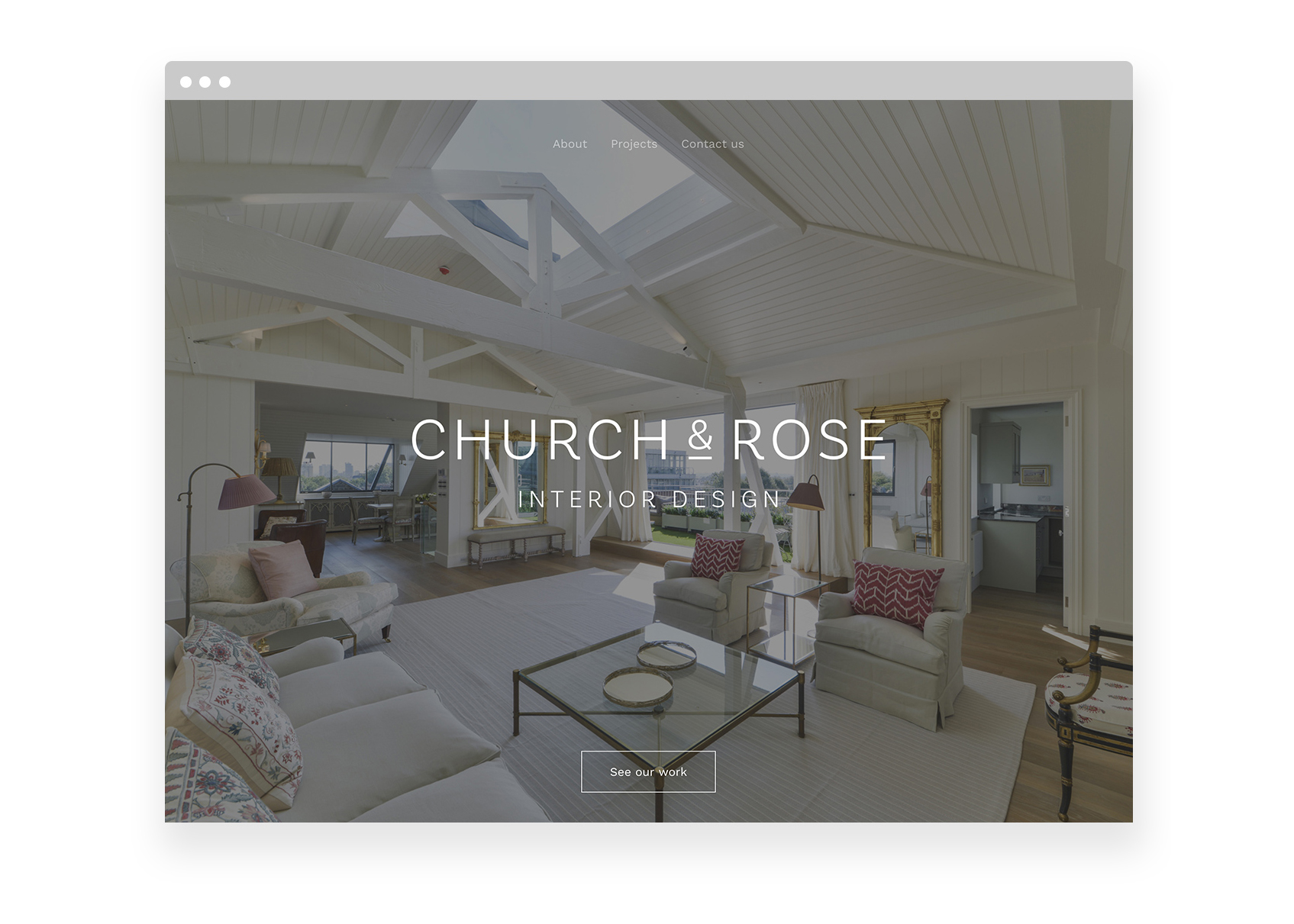
Web design for London interior designer firm Church & Rose
For us, it’s all about the brand. When a user arrives at a site they should feel that every aspect of the layout belongs to that company. Photography in particular is so key here and because of the significance of social media in marketing a business today, is rightly considered as important a part of the overall layout as the logo itself. Great quality images make a design job – and thus of course the experience of the user – such a pleasure. Overall, the disparate elements on a page must hang together as an effortless whole, which ensures the site feels cohesive. The layout of the page hangs all these together of course but with a considered, holistic approach to its ingredients, you’re half way there before even beginning.
Interior designers understandably want their work to be the star. That’s the biggest request I get when creating a ‘portfolio’ website. They will have a brand and things to say about themselves but in almost every case, they want the work left unadorned and even a suggestion of adding the simplest copy is regularly shunned. In the past I always assumed some sort of description would be necessary. Today that’s politely declined in almost every case! Fuss or bells and whistles like slideshows, thumbnail images or overt stylisation are out with the ark. The future of these sites is motion: it’s a shame that smaller interior designers can’t always afford professional video otherwise I suspect that would appear everywhere.
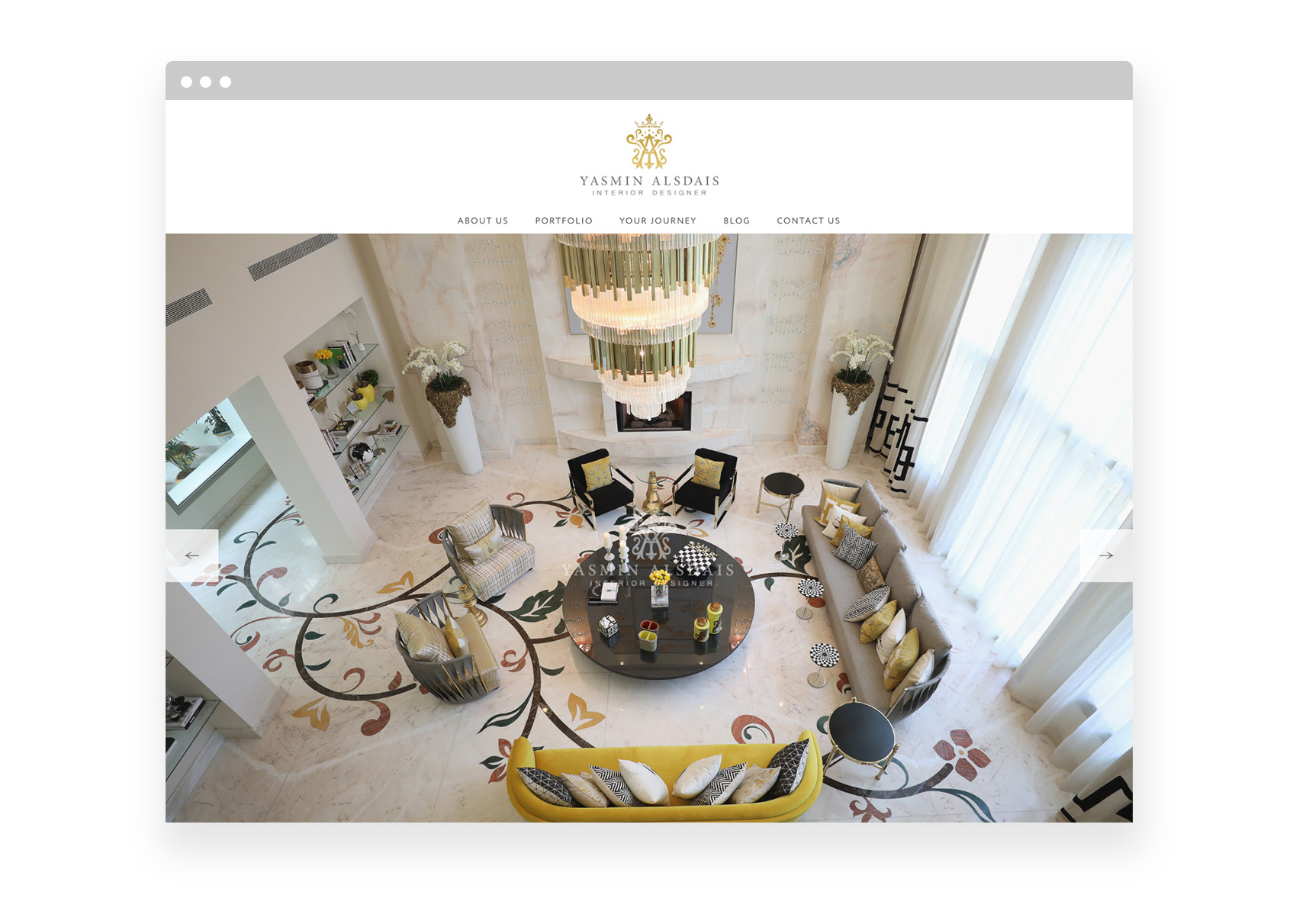
Web design for Saudi Arabian interior designer firm Yasmin Interiors
I would suggest that a ‘house style’ would be primary.
None of us know exactly what customers are going to want – by virtue of our clients’ taste being so varied. So I’d always advise my interior designer clients to stay confident in their style and judgment, putting their best, strongest work front and centre. Past projects that were somehow compromised often aren’t even worth showing.
I’d go so far as to say that three strong projects and some personal endorsements on each would go a long way towards selling them, their perspective and business.
Following that up with a strong expression of project management skills – or having a PM or CAD specialist on hand to work with them – is even better.

Web design for classic London fine art framing business Bourlet

Our feature in this month’s Furniture, Lighting & Decor magazine
If you run an interior design practice and require a website refresh, why not get in touch? Call us on 020 7351 4083 or email direct.
Our work in branding and web design for interiors specialists
Posted 1 week ago in brand identity, luxury hotel design, photography, web design
Read more
Posted 2 weeks ago in animation, brand identity, design chat, print, web design
Read more
Posted 1 month ago in brand identity, design chat, web design
Read more